Why colour modes are important in POD
Come and take a fleeting look at the world of colour modes: we promise you it's not that complicated.
As print professionals and technology enthusiasts, we at TPOP take the task of guaranteeing optimised print quality very, very seriously: it's really a question of honouring our material as much as your visuals by offering you a result that is clean, uniform, long-lasting and as smooth as possible. From our side, know this: we give everything, absolutely everything, to ensure that the result lives up to your expectations and those of your customers.
However, it is important to bear in mind that we are not entirely responsible for the appearance of the finished product after the printing phase. A number of criteria must be taken into account to ensure that the result is perfect...
In fact, we gave you the main tips for achieving the coveted heights of visual quality in a single article. If you haven't already done so, this is essential reading for the future of your Print on Demand career.
Well, now that we've got past these formalities, let's talk about a notion that we haven't mentioned together yet, and which nevertheless has a certain influence on the rendering of your product: colorimetry.
The colouriwhat now?
"Colorimetry" is a term that refers to the science of colors. We won't go into detail (it would be a shame to finish you off with boredom), but remember one thing: it is colorimetry that is at stake when we note the differences in colors between a visual viewed on a screen and the same visual following a print. The human eye is capable of perceiving a spectrum of colors which will not necessarily be translated in the same way depending on the medium on which the colors appear.
Because it is always more meaningful, here is a representation of the colors visible by the human eye, as well as the colorimetric spectra covered by the two modes of RGB (digital) and CMYK (printing).

RGB mode, ideal for all types of screens
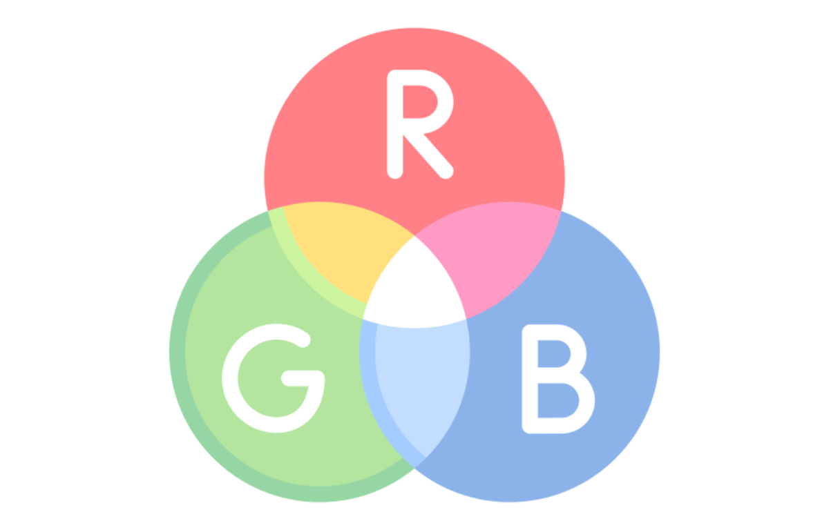
The RGB mode, which stands for Red Green Blue, will be the one used for mixing colors on all types of light-emitting displays (to put it simply, digital displays).
This colour mode presents results based on the mixture of these three different shades, which may vary greatly depending on the screen used for viewing and its settings. This spectrum, corresponding to the triangle visible in the pretty graphic above, is wider than that of CMYK: this means, in short, that a screen will be able to render more shades than printed media.
CMYK, the standard colour mode for printing
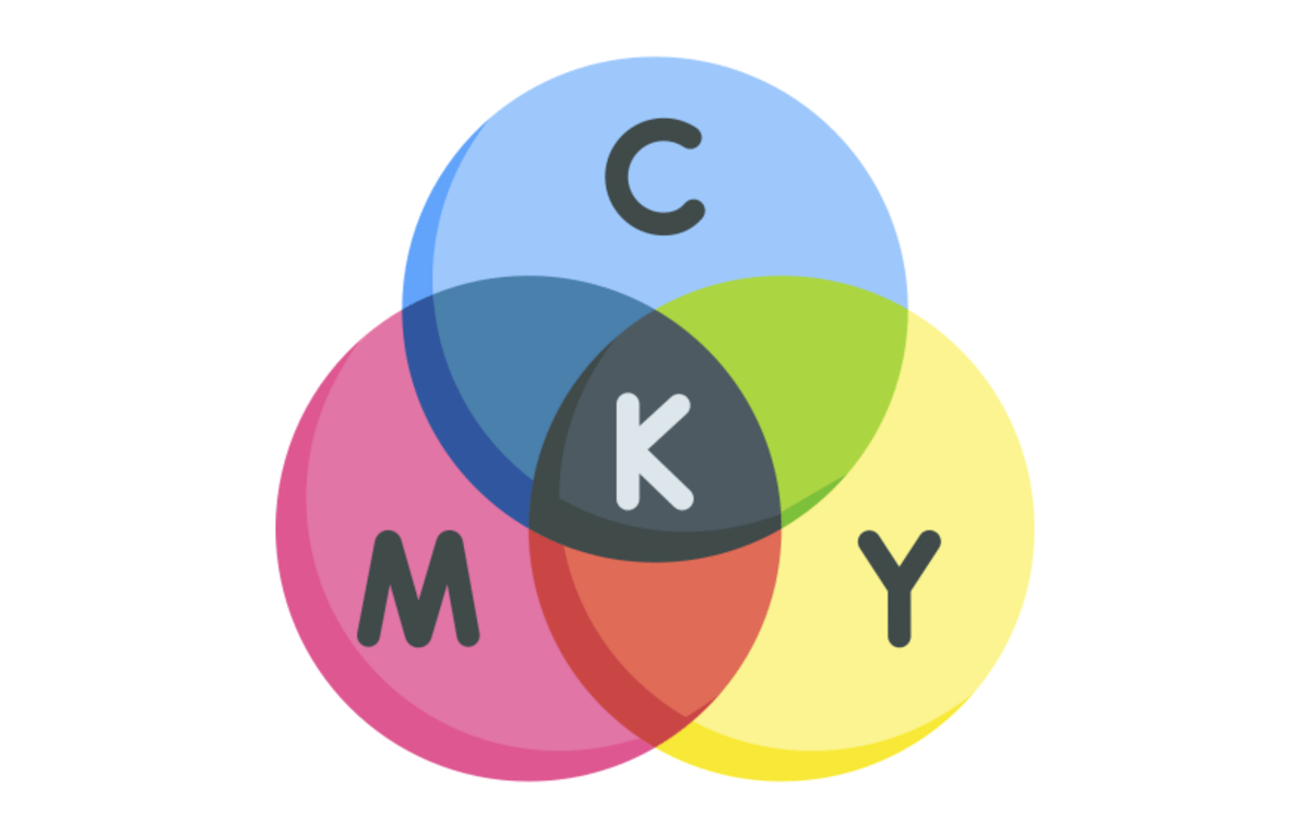
CMYK is a mode commonly called four-colour process in the printing industry, where it is particularly common, since it is the colour mode adapted to printed media (such as posters, t-shirts or even mugs: yes, just like the ones we are offering you). Its acronym refers to the four shades it brings together: cyan, magenta, yellow and black. Its range of colors is less extensive than that of RGB: it has about 16 million different shades, compared to 17 million in RGB. The difference may seem insignificant at first, but think again: a certain number of colors are excluded from four-colour printing, such as certain greens or electric blues, which will be completely eliminated.
Good to know: we know you're dreaming about it, but unfortunately, it's impossible: printing colors fluorescents in CMYK. It's hard enough to achieve anything approaching fluorescence on a screen in RGB mode, but CMYK simply won't let you. We don't like to disappoint you (at all), but that's the way it is...
Does the colour mode of my visual really matter?
In a word: yes.
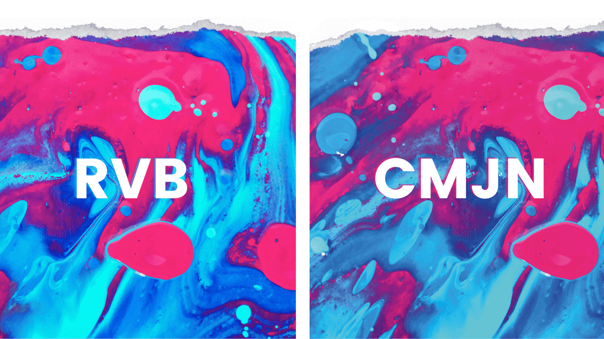
In several words: it turns out that your RGB file will be automatically converted to CMYK by the software that drives the printers. However, this late conversion will alter the appearance of your visual and some colors that will have accompanied you throughout the creation of your visual will be lost and will come out less vivid than expected. In this case, the important thing is to avoid unpleasant surprises by working directly in CMYK.
That's right. Easier said than done, you may think. Well, we had planned to explain to you how to do the conversion on different image processing software.
How to switch to CMYK mode in different software?
Opening a file in CMYK mode in order to work on it in this way will (unfortunately) not be made accessible by all software: indeed, software such as Gimp or Canva do not offer this precious option... At least, not initially. However, some plug-ins are available to take advantage of this possibility on Gimp: if you want to know more, don't hesitate to have a look at the tutorials that have been made on the subject.
Rest assured, the option is entirely within your reach if you are a regular user of the Adobe suite (and in particular of Illustrator and Photoshop). If this is your case, don't move: we'll explain how to do it.
Switching to CMYK mode in Photoshop
The famous Photoshop software will not only let you convert your RGB visual to CMYK but also create it directly in CMYK. Isn't it accommodating?
When creating your file, simply select the "CMYK Mode" option in the drop-down menu under the "Colour Mode" heading.
Forgot to do this when you created your file? Don't worry, nothing is lost as you can still perform the conversion from the "Edit" menu, by clicking on the "Convert to profile" sub-menu. From the window that will open at this stage, select the CMYK profile from the drop-down menu.
And... That's it, I promise. What an amazingly simple process.
Switching to CMYK mode in Illustrator
Like Photoshop, Illustrator is a very nice program: it lets you select the colorimetric profile as soon as the file is created. The process is very similar to the one we've just carried out on Photoshop, except for one detail: to find the colorimetric profile drop-down menu, you'll need to click on "Advanced Options". From there, you know the drill: all you have to do is select the CMYK mode and start creating. Similarly, to convert the colorimetric mode of your creation, the procedure varies little: click on "File" then "Document colorimetric mode".
Really good to know : Both programs allow you to check the colorimetric mode of your visual at a glance, as it appears in the file tab, following its name.
Let's face it, we've only just scratched the surface of the rich world of colorimetry in this article. However, we hope that it will have enlightened you about the basics of the subject, which will undoubtedly be useful to you to enhance your visuals.
In short, the following points should be remembered:
RGB is for screens.
CMYK is for printing media.
In POD, it is clearly preferable to work directly in CMYK to avoid unpleasant surprises linked to the reduction of the colour spectrum when switching to CMYK at a later stage.
This way, you'll be sure to use only colors suitable for printing, so there'll be no surprises when you receive your sample.


